 Entering &
Editing Data
Entering &
Editing Data
Previous Topic
Next Topic
| Common User Interface Elements
Entering &
Editing Data |
Previous Topic |
Next Topic |
Input fields provide a mechanism for you to enter data into the system. You will commonly find input fields in windows in which you fill in or update data about your facility, including when you apply for a permit or submit an emissions or compliance report. You will also encounter input fields in pop-up windows that appear when you invoke particular operations. Each instance of an input field type looks the same and works the same way throughout the system, no matter where it appears. This topic covers the various input types, illustrating their appearance and describing their operation. These include simple data input field types, such as
as well as more complex mechanisms such as The input mechanisms are listed above in approximate order of the frequency with which you will encounter them in the system.Although clearly related to the process of entering and editing data, edit operations buttons and data validation are covered in more detail on other Help topic pages (see Related Help Topics below).
Remember, the fields and data you see in the examples described here are just that, examples.
They may or may not represent specific fields you will see, depending upon your facility.
For example, you may see something here that you will only see in the system if your facility
is a Title V facility. However, the examples all illustrate concepts that you will see,
even if you won't see the particular example on this page.
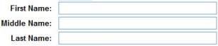
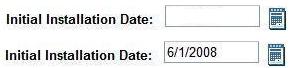
Text input fields provide a label identifying the information the field contains and a short box into which you type the information you want to enter into the system. Text fields may be short, where you will enter just a word or two, such as when you want to add someone as a contact for your facility, as shown in Figure 1.
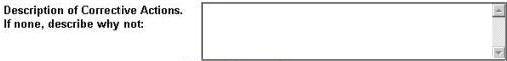
Or, the field may be longer, and may even provide scrolling if the information you are entering is likely to be long. You might see the example shown in Figure 2 when you enter a Compliance Report, to provide corrective action in response to a deviation you are reporting.
In either of these cases, you simply place the cursor in the field, type the information you wish to enter and then select Enter on the keyboard or move to a different field on the screen.
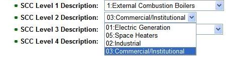
These four fields are the components of an SCC value for an emissions process. The options for
any field (each a component of the SCC) depend on the value you select for the previous field.
The options offered in the pick list for SCC Level 2 Description are limited to those that
apply for External Combustion Boilers. Whether fixed or variable
though,
you can see the options available to you by clicking on
the small blue arrow at the right of the field
( ). This will
bring up the list of available choices. Select a value
by clicking
on that entry in the option list.
). This will
bring up the list of available choices. Select a value
by clicking
on that entry in the option list.
You may, of course, simply type in the date you wish to specify. The system accepts nearly all formats for your date input: one or two digits for month and day; two or four digits for year; '-' or '/' to separate the date components. You cannot, however, mix the separator characters in the same date string. For example, 1-6/07 is not a valid input for a date field!
Alternatively, you may select a date from a calendar. Every date input field
shows a calendar icon ( )
to its immediate right whenever the field is available for edit. When you click on this
icon, it opens to a
calendar that allows you to select a date, as illustrated in Figure 6
)
to its immediate right whenever the field is available for edit. When you click on this
icon, it opens to a
calendar that allows you to select a date, as illustrated in Figure 6
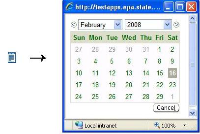
The calendar initially comes up with the current date highlighted. You may
navigate within the calendar, using the month and year pick lists or the
left ( )
and right (
)
and right ( )
arrows next to the pick lists to move either date component backward or
forward. Once the calendar shows the month you want, then
click on the day-of-the-month to select the date.
)
arrows next to the pick lists to move either date component backward or
forward. Once the calendar shows the month you want, then
click on the day-of-the-month to select the date.
The check box field shown in is essentially a Yes/No or True/False indicator, sometimes referred to as a 'flag'. If the box is checked, then the item's value is Yes or True; if it is not checked, as on the left, then the item's value is No or False. When you are entering or modifying data, you can change a check box simply by clicking in the box. The top part of Figure 7 shows a check box field from a Facility Detail page, which indicates the facility is not portable. Below that, it shows the Portable field checked, indicating a portable facility. This operation is sometimes referred to as "setting a flag". When you "set a flag", sometimes other fields open for input that apply only when that box is checked. In this case, Portable Group Type and Portable Group Name may both be specified; each of these fields has a fixed set of options defined within the Air Services system and hence is associated with a pick list as described above.
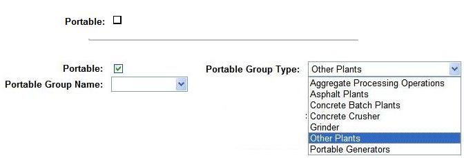
Figure 7: Check boxes for Data Display and Data Entry
In addition, check boxes appear in lists, where you may select (that is, check) one or more items to which you wish to apply some operation, normally described by the label on an operations button at the bottom of the list.
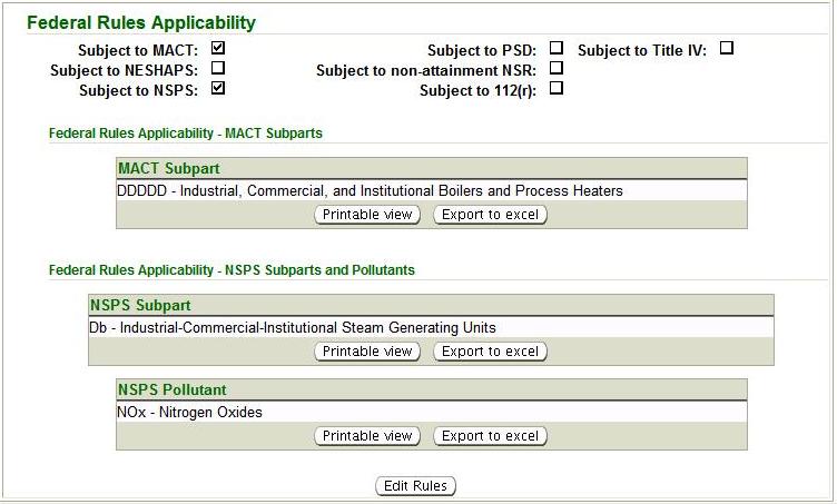
You may see check boxes when the system displays information to you in some locations where you do not actually use the check boxes to enter the data that the checkboxes present. For example, when you enter data for a PTI or PTIO permit application, you complete pick list fields that indicate whether your facility is subject to various Federal Rules, as shown in Figure 8. And, for each Federal Rule that applies, you may be asked to supply one or more additional pieces of information, often in an input table or list.

However, when you display the Federal Rules associated with your faciility, the system presents them as check boxes, along with any additional information you may have provided. (see Figure 8).
When they occur in groups, as in Figure 9, each check box is independent of any other check boxes that may appear to be displayed in the group. Whether a check box is marked or does not affect whether any other check box is marked.
Back to Top
Figure 10: Radio Buttons for Data Display and Data Entry
The check box field shown in is essentially a Yes/No or True/False indicator. If the box is checked, as on the right, then the item is Yes/True; if it is not checked, as on the left, then the item is No/False. When you are entering or modifying data, you can change a check box simply by clicking in the box.
Back to Top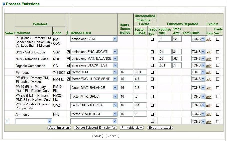
This figure actually illustrates several user interface concepts. Check boxes are used here for several purposes, including selecting pollutants that you have already added to the table and may now wish to delete, indicating whether a there are charges associated with each pollutant in the table (you may not edit this one; it's only there for your information), and any information in your report that you wish to remain Trade Secret. The Pollutant, Method, and Unit columns illustrate pick lists, while the data used to report or compute emissions are text input fields, where the required text input is numeric.
At the bottom of the list, you will find the  button
which gives you the capability to add pollutants to the list of pollutants for which
you are reporting emissions.
When you select this button, the system opens a new row in the table with a pick list
of the possible values for
the key field of the row you are adding (in this case, pollutants). Entering items in a
list or table is covered in more detail
in the discussion of Edit Button Operations.
button
which gives you the capability to add pollutants to the list of pollutants for which
you are reporting emissions.
When you select this button, the system opens a new row in the table with a pick list
of the possible values for
the key field of the row you are adding (in this case, pollutants). Entering items in a
list or table is covered in more detail
in the discussion of Edit Button Operations.
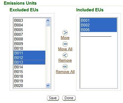
You may select one or more EUs on either side of the shuttle. (To select more than one, hold down the CTRL key while you select the EUs.) Then, select the appropriate button to move the selected EUs in the direction you wish to move them. In this example, the user has selected EUs B011, B012 and B013 from among the currently-excluded EUs. Upon clicking on the right arrow (img src="images/right_arrow.jpg") between the two sides of the shuttle, the system will move these EUs from the Excluded EUs list to the IncludedEUs list. Note that, rather than selecting individual EUs, you may Include ALL the EUs in a facility that are eligible to be included in the target application.
- Back to TopCopyright © 1996, 2004, Oracle. All rights reserved.